
Designing an App Like You Would a Home
Why you need to think like an architect to build amazing apps


“Generative AI puts some kind of simulacrum of a good designer in the hands of everyone with an internet connection.” — Stripe Annual letter (2023)
I’ve been building tech products since I was 12, yet it wasn’t until I designed my first Airbnb six years ago that I realized what sets the best product builders apart: a deep understanding of how humans interact with space.
A few years ago, Google ran a design experiment in Milan where participants walked through three rooms while tracking their heart rate, breathing, motion, and more. Each room showcased a different aesthetic: from soft, earthy tones in one to vibrant colors and sharp angles in another. With the experiment, Google proved that designers can influence our bodies and minds through their design choices — as obvious as the color of the walls or as subtle as the rounded corners of a coffee table.
This field of neuroscience, called neuroaesthetics, studies how sensory stimuli shape our moods, health, decision-making, social behaviors, movement, and more[0]. If you’ve ever instinctively chosen a certain seat in a classroom, felt immediately at ease in a spa, or preferred to linger in some cafes while taking your coffee to go in others—that’s neuroaesthetics in action.
And it’s happening in your digital spaces, too.
“With neuroscience now, you can prove the things that designers and artists have always known – that aesthetics (which is not just making things look pretty, but enlivening all the sensory systems through space, colour, texture, music, and shape) affects our brain, our physiology, and our well-being.” - Google’s vice president of hardware design, Ivy Ross
I started this series to help founders, builders, and designers create better products by applying the principles of physical space design to digital products. As AI makes good design more accessible, the best product builders will hone their mastery of space with strong intuition, moral reasoning, and a deep understanding of the human experience — alongside a clear vision of the world they want to create.
With that comes both an opportunity and a responsibility: how might we amplify the impact of our products by understanding how users naturally interact with space, and how might we do so while also supporting their flourishing?
What our digital spaces tell us
“Design is really an act of communication, which means having a deep understanding of the person with whom the designer is communicating.” ― Donald A. Norman, The Design of Everyday Things
Our minds perceive digital space similarly to the way they perceive physical space[1]. We map and navigate an app just as we would a building or a city: using landmarks, visual cues, and yes — even muscle memory. We associate screens, like rooms, with a clear purpose (or two): to cook, I go to the kitchen; to modify my account, I enter ‘Settings’. We even perceive depth and lighting similarly, as our attention is drawn to what’s “nearest” or in the spotlight.
In fact, the best products don’t require you to think; you intuitively know where to tap, what action to take next, and how to navigate. This isn’t by accident. Regardless of discipline, every design choice is a nudge, encoded with messages that push us to feel, move, act, and behave toward specific outcomes.
We, in turn, are wired to receive them.
In the physical world, we might find that our mood lightens as we walk into a sunny, brightly colored cafe filled with the smell of coffee; or that we tense up as we pass a dark, trash-riddled alley[2]. In the digital world, we might feel cognitive overload in a cluttered app, just as a cluttered room might make us feel overwhelmed; or excitement as a bright splash screen welcomes us in (like Snap’s!)
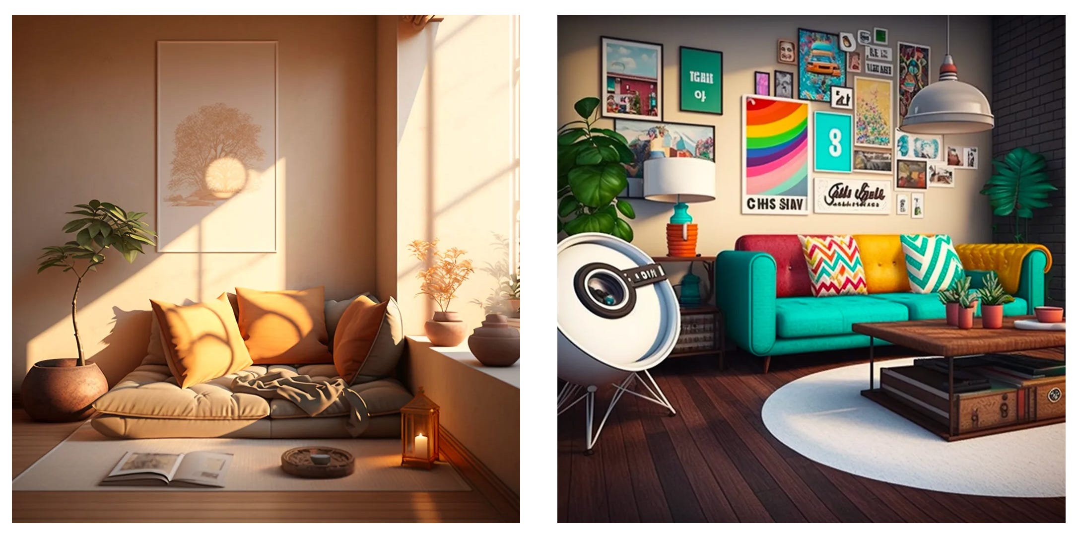
Take a look at these two rooms below. They have a lot in common, yet invite very different feelings, behaviors, and rituals. Can you pick out what they’re each saying and inviting you to do?
Now compare the two App Store listings below for Instagram and Calm. Both apps provide content, but each has a palpably different “vibe”. Which one invites you to slow down, and which one energizes you?
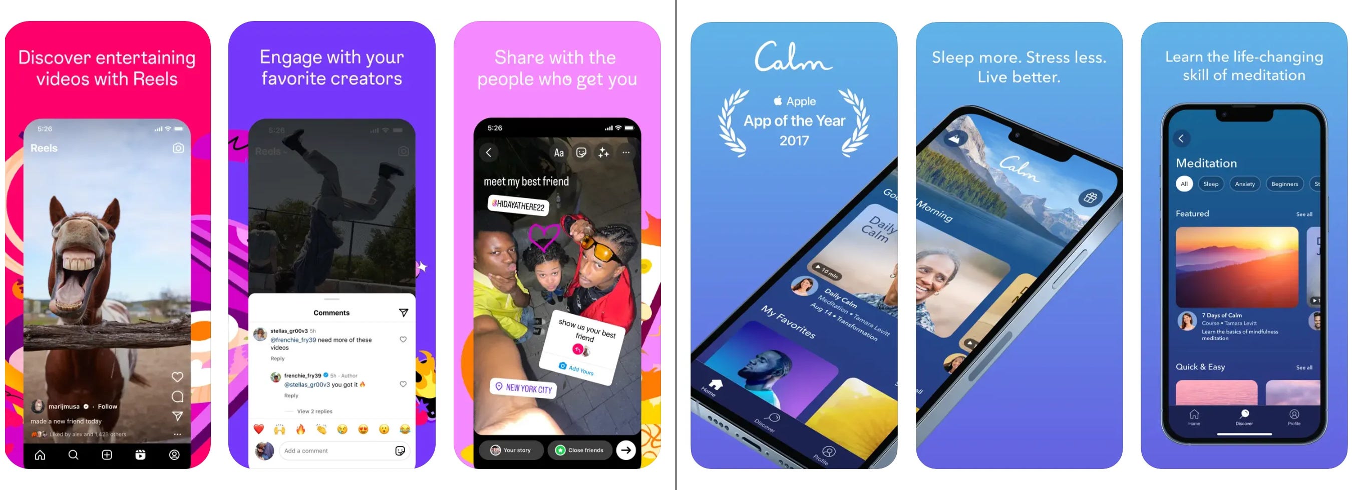
The designers behind the products above intentionally crafted each nudge using color, font, shapes, animations, and photos at the right place and time in the user journey. Each nudge supports the product’s mission and vision and ultimately helps the user accomplish their goals.
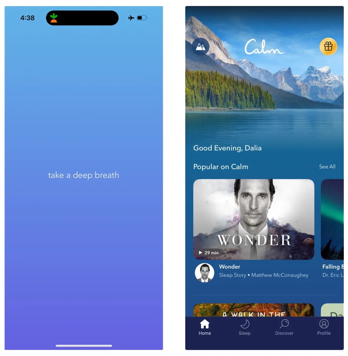
For example, Calm uses natural blues, soft gradients, and sounds and visuals of nature to evoke the app’s emotional signature of tranquility.
Equally important is what these designers chose not to build, as our brains can only process a limited amount of information at once. While Instagram uses infinite scroll to encourage engagement, Calm intentionally limits scrolling to instead nudge users to start a meditation as quickly as possible. Even the most subtle (or invisible) designs are LOUD, comprised of thousands of tiny nudges that guide us in those spaces.
The designer’s challenge is to simplify their interfaces and interactions and remove distractions in order to better guide a user’s focus. After all, the absence of intentional design doesn’t mean silence but rather a message out of our control.
We’ll dive deeper into nudges in a future post, but I’ll tease a bit of it here: nudges fall into one of four buckets — Atmosphere (how a user should feel in a space), Route (how a user wayfinds), Cue (what actions a user should take), and Habit (what behaviors should emerge over time) or ARCH. These nudges apply equally to physical and digital spaces, and you can apply this lens in any app you’re in to try to decode what the product or space is subtly (or not so subtly) telling you to do.
As a fun exercise, try to reverse-engineer the atmosphere of the Calm app into a physical space. You’re an architect, and your client shared their goal of living a healthier and more mindful lifestyle but struggles with the motivation to meditate day-to-day. How might you design a physical space to achieve those goals?[3]
What builders should do with this knowledge
“We shape our buildings and afterwards our buildings shape us” — Winston Churchill
I opened this post with a quote from Stripe’s annual letter in 2023 about the role of AI in design. I don’t believe AI will replace the best architects; humans are simply not rational enough to be understood by machines. AI can create “new”, but cannot recognize it as good, beautiful, or meaningful; AI can send a message, but it is not inherently motivated to do so on its own — and can’t understand what will move and surprise us. The same is true for all other types of builders, creators, and designers.
Instead, humans will seek out true mastery — and the stories these masters feel compelled to share.
As product builders and designers, it’s up to us to wield our influence with intention. For instance, AI doesn’t inherently understand why dark patterns[4] are wrong, even if it can be trained to detect them; what sets us apart is not just our ability to morally reason, but also our ability to deeply care about people.
Every product we design is a space that people will inhabit. Like architects, we must balance an understanding of and care for our clients’ needs and motivations with the messages we seek to put out into the world. We must imbue our rooms with purpose and give our users clarity and confidence as they move from room to room.
Simply put, we need to design apps the way we would design our homes.
About this series and why I care so much about it
Despite growing up around blueprints and fabric swatches, I never cared to enter the same career as my parents in real estate development. My interests took me down a different path: I taught myself to code at age 12 and have been building products ever since!
But when I helped my grandmother redesign and rent out her home on Airbnb just six years ago, I realized that the two disciplines had more to learn from one another than not. Later that year, when I launched my startup, the realization solidified: you can’t build a standout product until you begin to see digital products as extensions of physical space.
In this series, I’ll be writing on the intersection of architecture, interior design, and product design—covering everything from the foundations of interior design, Marie Kondo-ing a digital space, “broken balconies”, adaptive design, and more, with case studies from my favorite designers across disciplines as well as products I’ve built across my career — including most recently at Stripe.
In the meantime, here’s a final exercise to leave you with:
Take 10 seconds to look at the space around you. What is it telling you? How do the colors make you feel? Why did you sit where you decided to sit? What does the arrangement of furniture encourage you to do? Where do you spend the most time in this space, and why?
Footnotes
[0] Neuroaesthetics impacts our emotional responses, cognitive processing, physical and mental health (and quality of life), and more. It also combines with behavioral psychology, interaction design, cognitive science, and more to make up the psychology of space or environmental psychology. Related schools of thought: feng shui, works on the psychology of architecture and urban design, and studies on incorporating nature into our spaces to improve creativity and moods.
[1] Our language reflects this too, as we “visit” or “go to” websites and “return home”. See research on cognitive mapping in interface design (incl. information architecture) as well as navigation in virtual reality and gaming. Mixed reality blurs those lines further!
[2] It’s important to note that even in the Google study, the “ideal” environment wasn’t the same for everyone. While we can’t generalize for all, people are more alike than different, and there are many familiar patterns we should lean on. This emphasizes why it’s so important to know who exactly you’re designing for.
[3] Fun fact, the second living room photo above was generated with “Instagram-inspired” living room as the prompt; do you see the similarities between the living room and the app store screenshots?
[4] Of course, humans are responsible for dark patterns, too. I find the companies most likely to use them aren’t users-first and prioritize short-term financial gain at the expense of both the user and the business’s long-term goals (which ought to converge). Here are some common dark patterns to avoid.
Love this framing / articulation / application of a timeless concept. I was an architecture major before finding my way to business, teaching, and now, product design. My architect uncle trained me from a very young age to have an eye and appreciation for everything you're discussing, and it's been applicable in every facet of my life... from designing classroom layouts, lesson plans, and worksheets for squirmy middle schoolers to now reimagining the way we consume news and form opinions. Excited to take the ARCH lens to our work.