
03 Atmosphere: Getting the vibes right
The emotional baseline of product experience and how it quietly shapes whether users return

This post is part two of a five-part introduction to ARCH, a framework that helps founders and PMs build better products. ARCH examines four dimensions: Atmosphere (how users feel), Route (how users move), Cue (how users act), and Habit (what behaviors form).
“Only a few people can explain why a given design makes them feel a certain way, or why they prefer one space over another[.]” Christian Grosen, Muuto Design Director
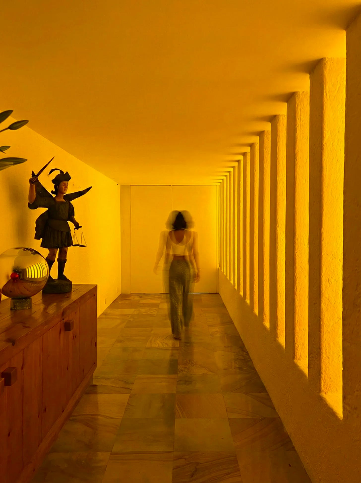
I’ll be honest, I wasn’t a huge fan of Luis Barragán’s aesthetic when I first visited Casa Gilardi in Mexico City. The renowned Mexican architect’s austere-minimalist-nearly-brutalist style just wasn’t my contemporary-Mediterranean cup of tea. That being said, I left the tour with a full page of notes, absolutely floored by how masterfully he controlled the space and, well, me.
Of course, every room was artfully designed to support its purpose, centered on an action (cook, sleep, host, work, etc.) — this part is obvious to any architect. But what struck me was how carefully he prepared us for the way each space was meant to be used.
The entryway created a clear separation from the busyness of the outside world — the silence was so profound my shoulders dropped the moment the door closed. Ceilings lowered in the color-flooded corridor before a big reveal of a grand hosting room, creating a moment of suspense before awe. In private spaces, I felt cocooned; in social spaces, I felt expansive, light, drawn in.
Even if I didn’t love his aesthetic, I was awed by how much he could make me feel in less than an hour — both in and between rooms.
This is Atmosphere at work.
It’s fun to see it in action in digital spaces, as well. I sat in on usability interviews last year with a talented designer on my team at Stripe. The moment the designs first flashed up on the screen, users visibly perked up — we even got a few excited ‘oohs’!
This was within the first few seconds, before they’d even read the text or explored the wireframe. Something clicked instantly.
The 🅐 in ARCH: How users feel in a space
Atmosphere is what you feel before you’ve even processed what you’re looking at. It’s the emotional and cognitive conditions that (if designed right) prime you for what the space asks of you — whether to meditate, to connect, to shop, or to scroll. Just as a warm, candle-lit living room might help you relax, every app, flow, and screen creates an atmosphere — whether intentionally or not.
Getting Atmosphere right is critical, because it shapes how everything that follows is interpreted — and whether users trust the product enough to make a purchase and come back.
A “buy” button, for example, can feel decisive or risky depending on how much confidence the atmosphere has built beforehand. Habits can be either reinforced or discouraged by the emotions users associate with returning. The key question to ask: what kind of atmosphere can best support the interaction ahead?
As the emotional architect of the space, you own these decisions. Your role is to understand the mindset users arrive with and shape the conditions that help them accomplish their goals. So how do you do this?
Shaping Atmosphere
In a home, you’d influence the atmosphere through the interaction of material, color, texture, lighting source (and warmth), compression, spatial flow, and more.

In digital spaces, you have an equally rich toolkit. While color is one of the most recognizable atmospheric signals, Atmosphere isn’t limited to branding or visual identity.
Infinite scroll, for example, is an atmospheric decision: it removes natural stopping points, blurs a user’s sense of time, and keeps them in a state of passive receptivity. It can be a strategic choice to boost engagement for social media or news outlets, while products that want to signal calm or intentionality might instead slow the pace by limiting choices and creating deliberate endpoints.
Some of the design signals in the Atmosphere toolkit:
* Visual: color, typography, graphics, iconography
* Verbal: tone of voice, copy, microcopy
* Tactile/interactive: animation, haptics, transitions, swipe patterns
* Rhythm/pace: speed, information density, white space, stopping points (e.g., infinite vs. finite scroll)
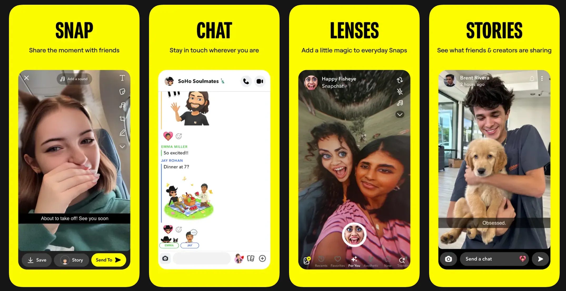
* Auditory: sound, ambient feedback Let’s take Snapchat vs Tinder to see how atmospheric decisions can drastically change the vibe.
Snapchat’s value proposition is self-expression and fun with friends; Tinder’s is romantic connections. Both are social platforms, but they prime users for very different kinds of connection.
Snapchat wants to lower the stakes for sharing. To do so, it places users in a playful and spontaneous mindset: ephemeral messages, bold colors, smooth animations, a silly mascot, quick capture. Everything communicates: this doesn’t have to be perfect.
By contrast, Tinder wants to lower the stakes for matching. Its atmosphere is more flirty and charged: bold and sensual color palette, short and witty copy, swipe mechanisms, endless card stacks, and a celebratory match animation. It even defaults to dark mode — easier on the eyes for late-night swiping and mirrors an intimate late-night date at a bar. It communicates: swipe now, commit later.
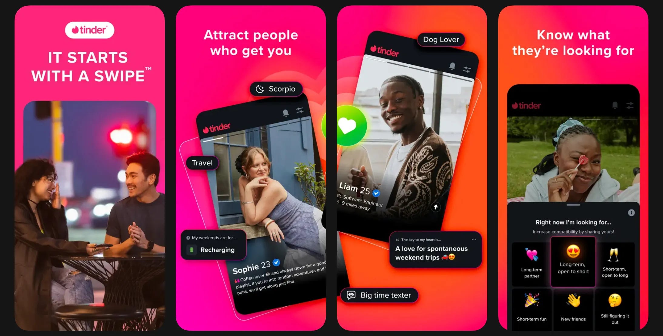
Though they both enable connection, they design very different atmospheres to put users in the right mindset for the “room”, and as stated earlier, this impacts everything else that follows: how quickly users create, how much they self-censor, how rapidly they swipe, and how easily they move on.
To make this difference more palpable, let’s look at what Snapchat and Tinder would look like as living rooms. What differences do you notice? What purpose is each space suited for?
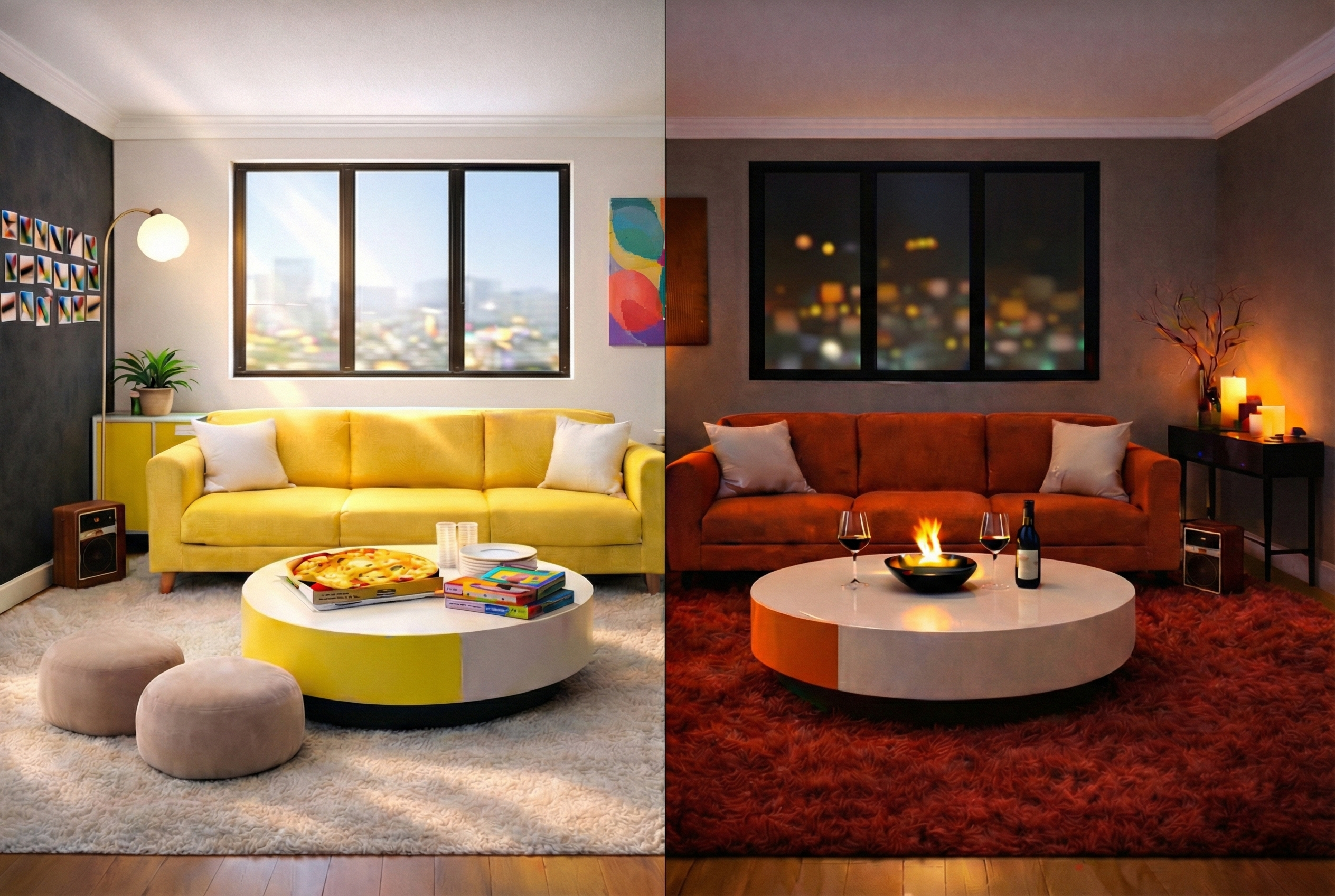
How Atmosphere changes within space and time
Like a home, a digital product might have many rooms, each with their own purpose. How does the Atmosphere change as a product grows in complexity?
Atmosphere can (and often should) adapt subtly across moments within the user journey — both to support the different tasks in each “room” (inspiration on a Home screen, focus in a creation or reading flow) and to meet the emotional state users arrive in. But these variations should all ladder up to a consistent signature or baseline feeling that defines the product as a whole and supports its value proposition.
The key is coherence. Well-designed homes feel cohesive even as rooms change in purpose. Products should, too.
Importantly, Atmosphere leaves an emotional memory that stays with users. What a product consistently makes people feel becomes part of the association with the brand — whether stressful, calming, energizing, etc. — and is an important part of whether they return.
Assess your products
Audit the apps you’re building, or one you use daily, through the lens of Atmosphere. Which elements of the toolkit are most pronounced, and which are you neglecting? What do they each signal?
Next up: Atmosphere in Action
A case study on a popular travel app that missed the mark on Atmosphere, and how it impacts how users perceive everything that follows.
ARCH in practice: Operationalizing Atmosphere with AI
If you’re exploring Atmosphere in your own product, here’s a prompt you can plug into AI to help you gut-check your design choices.
PROMPT
You are a product design strategist focused on emotional experience. Help me define the emotional/cognitive atmosphere and signature of this [product/user flow] so users are in the right mindset to take the desired action.
My product, [product name], is a [product type — e.g., mobile app, web platform] made for [target user — who they are, context, or pain points]. Our mission is to [insert mission statement].
The product helps users [desired goal/behavior], ideally as a [quick task, repeatable ritual, long-form session, etc.] [Optional: Adding what user journey you’re designing for.]
I want the interface and experience to emotionally support that behavior.
Output Format:
Ideal emotional/cognitive state(s) to support intended action:
Design mood keywords:
Brand personality (1–2 sentences):
Design decisions (visual, verbal, tactile/interaction, rhythm/pace, auditory):
Design watch-outs (separate thematic and tactical decisions):
Example inspirations:
Observable signals that the atmosphere is working (key behavioral metrics or success indicators):
OPTIONAL FOLLOW-UP
Read this article: https://daliakatan.substack.com/p/arch-atmosphere. Evaluate the attached product screenshots for their Atmosphere. Help me assess whether the product design aligns with its ideal experiential atmosphere.
Really loved how you pulled atmosphere out of the abstract and showed it as a felt design decision, not just colors or fonts, but the emotional and cognitive “pre-frame” that greets users before they even think. The Snapchat vs Tinder point especially nails how two products with the same broad goal can create wildly different mindsets.